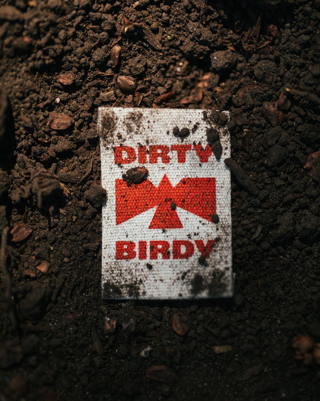
Dirty Birdy
Workwear for women, powered by female makers.
Brand positioning / Naming / Visual identity / Verbal Identity
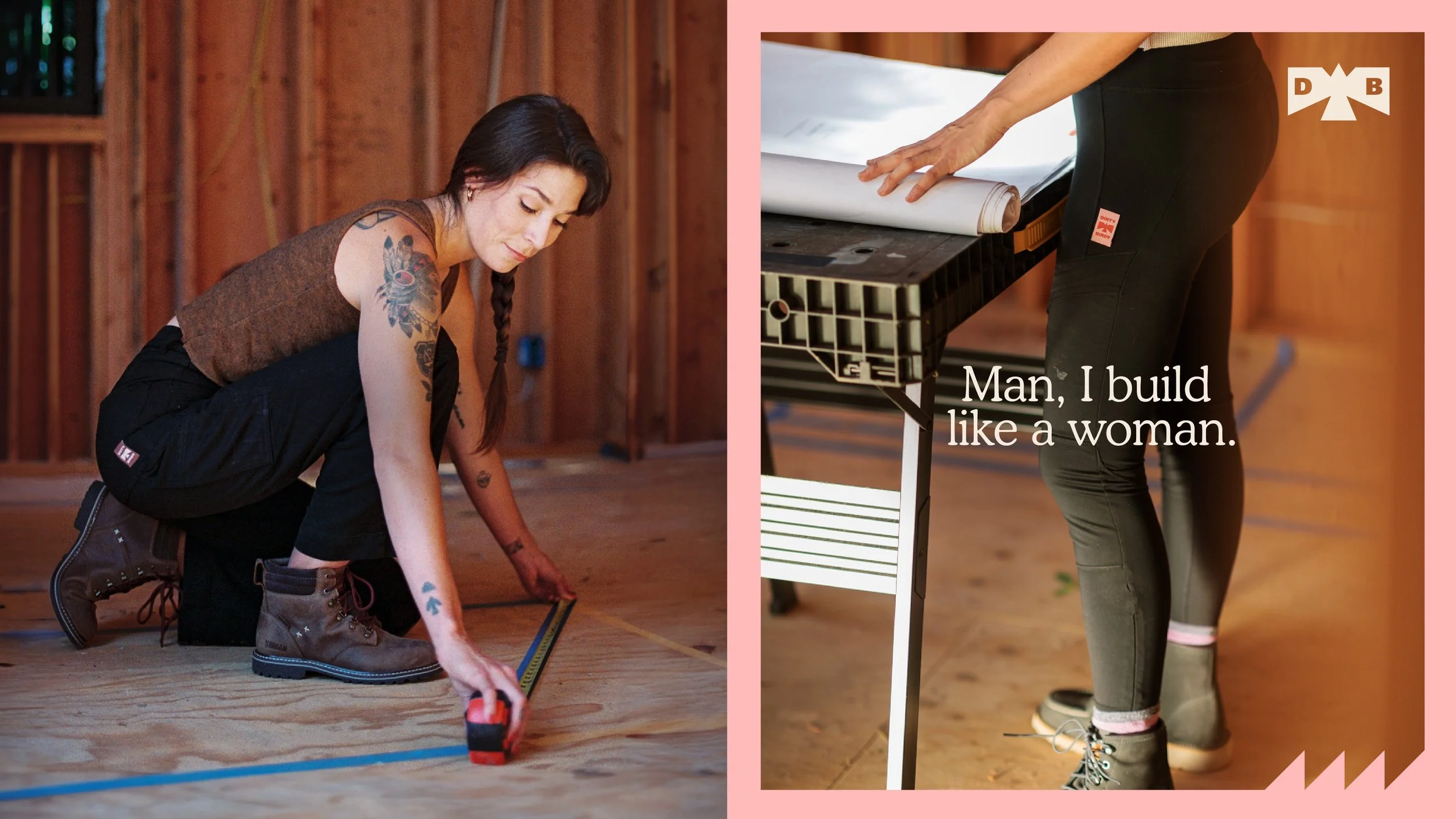
Uniting style and comfort with durability – so we can empower female makers to do-it-all.
It all started with when our clients, Anna & Derek, bought their first house in California and decided to fix it up themselves. Anna quickly realised that there was a gap in the market when it came to traditional womens workwear. Workwear brands were made for men, and translated poorly to women. Others exist but are far from fashionable.
Their vision? To create workwear that blends innovation, durability, and comfort—designed to withstand tough conditions yet stylish enough to wear straight to the bar right after.
We identified three core consumer groups: tradeswomen –those who rely on workwear daily, hobbyists and DIYers, and active lifestyle enthusiasts drawn to functional, durable clothing for everything from gardening, camping, to just walking the dog.
Our ambition? To do for workwear what Oatly did for milk alternatives—shift it from a niche product, into a cultural movement driven by identity and purpose. We wanted to create a brand that unites style, comfort, and durability – so we can empower female makers to do-it-all.

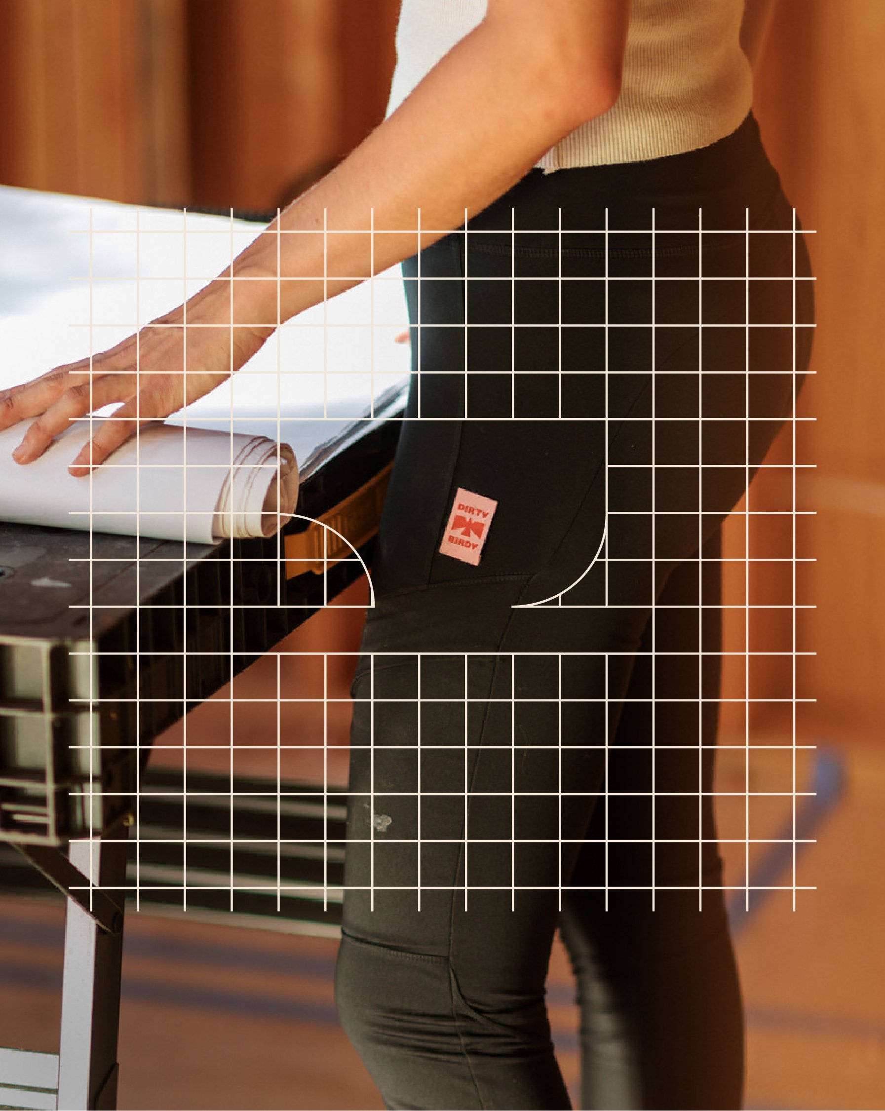
Using tools of the trade to create a visual system.
We set out to create an identity that empowers women to get their hands dirty—transforming tools into brand expressions. At its core, the system is designed to break down the barriers to DIY, making the world of making feel more accessible and less intimidating. By pairing a visual language inspired by tools with a playful tone of voice, we built a brand that encourages confidence to do the thing.